
2.2. Figure 2 - Economic implications of net-zero scenarios

Licensed under the MIT License.
This notebook is part of a repository to generate figures and analysis for the manuscript
Keywan Riahi, Christoph Bertram, Daniel Huppmann, et al. Cost and attainability of meeting stringent climate targets without overshoot Nature Climate Change, 2021 doi: 10.1038/s41558-021-01215-2
The scenario data used in this analysis should be cited as
ENGAGE Global Scenarios (Version 2.0) doi: 10.5281/zenodo.5553976
The data can be accessed and downloaded via the ENGAGE Scenario Explorer at https://data.ece.iiasa.ac.at/engage. Please refer to thelicenseof the scenario ensemble before redistributing this data or adapted material.
The source code of this notebook is available on GitHub at https://github.com/iiasa/ENGAGE-netzero-analysis. A rendered version can be seen at https://data.ece.iiasa.ac.at/engage-netzero-analysis.
[1]:
from pathlib import Path
import math
import numpy as np
import matplotlib as mpl
import matplotlib.pyplot as plt

import pyam
Import the scenario snapshot used for this analysis and the plotting configuration
[2]:
data_folder = Path("../data/")

output_folder = Path("output")
output_format = "png"
plot_args = dict(facecolor="white", dpi=300)
[3]:
rc = pyam.run_control()
rc.update("plotting_config.yaml")
[4]:
df = (
    pyam.IamDataFrame(data_folder / "ENGAGE_fig2.xlsx")
    .filter(year=range(2020, 2101, 5))
    .convert_unit("billion US$2010/yr", "trillion US$2010/yr", factor=1e-3)
)
pyam - INFO: Running in a notebook, setting up a basic logging at level INFO
pyam.core - INFO: Reading file ../data/ENGAGE_fig2.xlsx
pyam.core - INFO: Reading meta indicators
Apply renaming for nicer plots.
[5]:
df.rename(model=rc["rename_mapping"]["model"], inplace=True)
Prepare GDP data
Check if GDP|PPP is available, else use GDP|MER
[6]:
no_ppp = df.require_variable("GDP|PPP", exclude_on_fail=True)
pyam.core - INFO: 60 scenarios do not include required variable `GDP|PPP`, marked as `exclude: True` in `meta`
[7]:
df_gdp = df.filter(exclude=False, variable="GDP|PPP")
df_gdp.append(df.filter(exclude=True, variable="GDP|MER"), inplace=True)
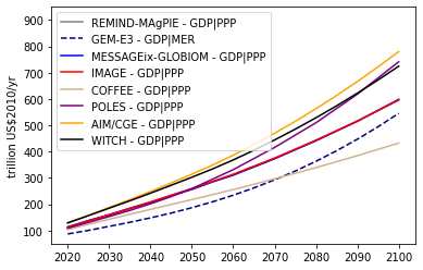
GDP development in a no-policy scenario
This figure is included as Figure 1.1-11 in the Supplementary Information.
[8]:
fig, ax = plt.subplots()

df_gdp.filter(scenario="EN_NPi2100").plot(
    ax=ax,
    color="model",
    linestyle="variable",
)

#ax.set_title("GDP development in the NPi scenario\n(without a carbon budget)")
ax.set_title(None)
ax.set_xlabel(None)

color_cat = rc["color"]["model"].copy()
ax.set_ylim(50, 950)

fig.savefig(output_folder / f"fig2_annex_gdp_baseline.{output_format}", **plot_args)
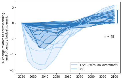
Panel a - Relative GDP development in mitigation scenarios
Development of GDP in mitigation scenarios with limited overshoot and no net-negative CO2 emissions (NNCE) relative to scenarios with overshoot and NNCE in the second half of the century. In the near term, the GDP of net-zero budget scenarios is relatively lower but this is compensated in the second half of the century where GDP in net-zero budget scenarios grows bigger.
[9]:
df_mitigation = df_gdp.filter(scenario="EN_NoPolicy", keep=False)
[10]:
df_peak = df_mitigation.filter(scenario_family="NPi", budget_type="peak_budget")
peak = df_peak._data
[11]:
full_century = df_mitigation.filter(budget_type="full_century_budget")._data
[12]:
scenario_mapping = dict([(f"{s}f", s) for s in df_peak.scenario])
full_century.index = pyam.index.replace_index_values(full_century, "scenario", scenario_mapping)

# downselect to scenarios that have both a peak-budget and a full-century budget version
full_century = full_century.loc[peak.index]
[13]:
df_relative = (
    pyam.IamDataFrame((peak / full_century - 1) * 100, meta=df.meta)
    .rename(unit={"trillion US$2010/yr": "% change relative to corresponding\nend-of-century budget scenario"})
)
[14]:
fig, ax = plt.subplots(figsize=(6, 4))

color_cat = ["2C", "1.5C (with low overshoot)"]
_df = df_relative.filter(scenario_family="NPi", category=color_cat)

_df.plot(ax=ax, color="category", fill_between=True, final_ranges=True)

ax.set_title(None)
ax.set_xlabel(None)
ax.set_xlim(2015, 2105)

ax.legend([
    mpl.lines.Line2D([0, 1], [0, 1], color=rc["color"]["category"][c]) for c in reversed(list(color_cat))
], reversed(["2°C", "1.5°C (with low overshoot)"]), loc=4)

pyam.plotting.set_panel_label(f"n = {len(_df.index)}", ax=ax, x=0.85, y=0.5)

plt.tight_layout()
fig.savefig(output_folder / f"fig2a_relative_gdg.{output_format}", **plot_args)
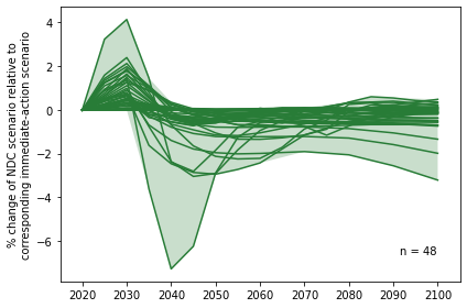
Panel b - Development of GDP in immediate-action scenarios
Development of GDP in immediate-action scenarios relative to scenarios with an equivalent carbon budget which follow NDC pathways until 2030. In the near term, the GDP of NDC scenarios is higher because mitigation action is delayed but this is compensated by 2040 when GDP in the NDC scenario falls below the immediate-action scenarios (and never catches up).
[15]:
df_npi = df_mitigation.filter(scenario_family="NPi")
npi = df_npi._data
[16]:
ndc = df_mitigation.filter(scenario_family="INDCi")._data
[17]:
ndc_scenario_mapping = dict([(s.replace("NPi2020", "INDCi2030"), s) for s in df_npi.scenario])
ndc.index = pyam.index.replace_index_values(ndc, "scenario", ndc_scenario_mapping)
[18]:
df_relative = (
    pyam.IamDataFrame((ndc / npi - 1) * 100, meta=df.meta)
    .rename(unit={"trillion US$2010/yr": "% change of NDC scenario relative to\ncorresponding immediate-action scenario"})
)
The pyam-plotting fill_between requires setting the colors via the RunControl.
The following cell sets the color for Panel b, overriding the default configuration for this project.
[19]:
rc_blue_2c = rc["color"]["category"]["2C"]
rc["color"]["category"]["2C"] = "xkcd:darkish green"
[20]:
fig, ax = plt.subplots(figsize=(6, 4))

_df = df_relative.filter(category=["2C"])
_df.plot(ax=ax, color="category", fill_between=True, legend=False)

ax.set_title(None)
ax.set_xlabel(None)
ax.set_xlim(2015, 2105)

pyam.plotting.set_panel_label(f"n = {len(_df.index)}", ax=ax, x=0.85, y=0.1)

plt.tight_layout()
fig.savefig(output_folder / f"fig2b_relative_gdp_ndc.{output_format}", **plot_args)
Reset the color the run control to the defaults for Panel c.
[21]:
rc["color"]["category"]["2C"] = rc_blue_2c
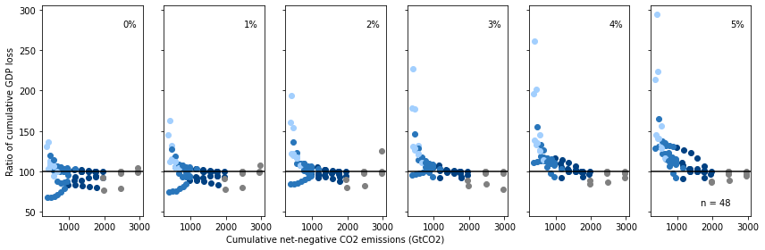
Panel c - Ratio of cumulative GDP loss assuming different discount rates
The ratio of cumulative GDP loss (NPV, 2020–2100) assuming different discount rates (0–5%). The discount rates are applied exogenously to the GDP pathway of each scenario. The perceived overall costs of each scenario (cumulative GDP loss from mitigation policy) differ for each discount rate reflecting the different weights of costs over time.
The figure shows the NPV price ratio between net-zero budget scenarios with limited overshoot and their corresponding end-of-century carbon budget scenarios (ratio <100 means that scenarios with limited overshoot are perceived to be overall less costly under the specific assumptions). Each dot represents the ratio for a pair of scenarios with a specific carbon budget (x axis).
[22]:
npi = df_gdp.filter(scenario="EN_NPi2100")._data.copy()
npi.index = npi.index.droplevel(["scenario", "variable"])
[23]:
mitigation = df_gdp.filter(scenario=["EN_NoPolicy", "EN_NPi2100"], keep=False)._data.copy()
mitigation.index = mitigation.index.droplevel("variable")
[24]:
df_gdp_loss = pyam.IamDataFrame(npi - mitigation, variable="GDP loss", meta=df.meta)
gdp_loss = df_gdp_loss.timeseries()
[25]:
baseyear = 2020
discount_rates = range(0, 6)
[26]:
for r in discount_rates:
    gdp_loss_npv = gdp_loss.copy()
    for y in gdp_loss_npv.columns:
        gdp_loss_npv[y] = gdp_loss_npv[y] / math.pow(1 + r / 100, y - baseyear)

    label = f"Cumulative GDP loss (NPV {r}%)"
    df_gdp_loss.set_meta(
        meta=gdp_loss_npv.apply(pyam.cumulative, axis=1, first_year=2020, last_year=2100),
        name=label
    )

    gdp_loss_npv_full_century = (
        df_gdp_loss.filter(budget_type="full_century_budget")
        .meta[label]
    )
    gdp_loss_npv_full_century.index = (
        pyam.index.replace_index_values(
            gdp_loss_npv_full_century, "scenario", scenario_mapping)
    )
    gdp_loss_npv_peak_budget = (
        df_gdp_loss.filter(budget_type="peak_budget")
        .meta[label]
    )

    rel_gdp_loss_npv =  gdp_loss_npv_peak_budget / gdp_loss_npv_full_century * 100
    rel_gdp_loss_npv = rel_gdp_loss_npv[rel_gdp_loss_npv > 1]
    df_gdp_loss.set_meta(
        meta=rel_gdp_loss_npv,
        name=f"Relative GDP loss (NPV {r}%)"
    )
[27]:
fig, ax = plt.subplots(1, len(discount_rates), figsize=(12, 4), sharex=True, sharey=True)

for i, r in enumerate(discount_rates):
    df_gdp_loss.filter(budget_type="peak_budget", scenario_family="NPi")\
    .plot.scatter(ax=ax[i], x="cumulative_emissions_2100", y=f"Relative GDP loss (NPV {r}%)",
                  color="category", legend=False)

    ax[i].set_xlabel(None)
    ax[i].set_ylabel(None)
    ax[i].set_ylim(45, 305)
    ax[i].axhline(y=100, color="black")
    pyam.plotting.set_panel_label(f"{r}%", ax=ax[i], x=0.80)

pyam.plotting.set_panel_label(f"n = {len(_df.index)}", ax=ax[5], x=0.5, y=0.05)

ax[2].set_xlabel("Cumulative net-negative CO2 emissions (GtCO2)")
ax[0].set_ylabel("Ratio of cumulative GDP loss")

plt.tight_layout()
fig.savefig(output_folder / f"fig2c_relative_gdp_loss_npv.{output_format}", **plot_args)
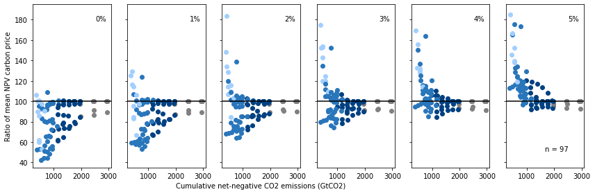
Ratio of net-present value carbon prices assuming different discount rates
The following figure is a variation of Panel c using carbon prices instead of GDP loss.
It is included as Figure 1.1-12 in the Supplementary Information.
[28]:
horizon = range(2020, 2101, 5)

df_price = (
    df.filter(scenario_family="NPi", variable="Price|Carbon")
    .filter(scenario="EN_NoPolicy", keep=False)
    .filter(year=horizon)
    .interpolate(horizon, inplace=False)
)
carbon_price = df_price.timeseries()
[29]:
baseyear = 2020
discount_rates = range(0, 6)
[30]:
for r in discount_rates:
    carbon_price_npv = carbon_price.copy()
    for y in carbon_price.columns:
        carbon_price_npv[y] = carbon_price_npv[y] / math.pow(1 + r / 100, y - baseyear)

    label = f"Mean Carbon Price (NPV {r}%)"
    df_price.set_meta(meta=carbon_price_npv.apply(np.mean, axis=1), name=label)

    price_npv_full_century = (
        df_price.filter(budget_type="full_century_budget")
        .meta[label]
    )
    price_npv_full_century.index = (
        pyam.index.replace_index_values(
            price_npv_full_century, "scenario", scenario_mapping
        )
    )
    price_npv_peak_budget = (
        df_price.filter(budget_type="peak_budget")
        .meta[label]
    )

    rel_npv =  price_npv_peak_budget / price_npv_full_century * 100
    df_price.set_meta(meta=rel_npv.dropna(), name=f"Relative Carbon Price (NPV {r}%)")
[31]:
fig, ax = plt.subplots(1, len(discount_rates), figsize=(12, 4), sharex=True, sharey=True)

_df = df_price.filter(budget_type="peak_budget")

for i, r in enumerate(discount_rates):

    _df.plot.scatter(ax=ax[i], x="cumulative_emissions_2100", y=f"Relative Carbon Price (NPV {r}%)",
                  color="category", legend=False)

    ax[i].set_xlabel(None)
    ax[i].set_ylabel(None)
    ax[i].set_ylim(35, 195)
    ax[i].axhline(y=100, color="black")
    pyam.plotting.set_panel_label(f"{r}%", ax=ax[i], x=0.80)

pyam.plotting.set_panel_label(f"n = {len(_df.index)}", ax=ax[5], x=0.5, y=0.1)

ax[2].set_xlabel("Cumulative net-negative CO2 emissions (GtCO2)")
ax[0].set_ylabel("Ratio of mean NPV carbon price")

plt.tight_layout()
fig.savefig(output_folder / f"fig2_annex_relative_carbon_price_npv.{output_format}", **plot_args)
[ ]: