
2.1. Figure 1 - Emissions and temperature characteristics

Licensed under the MIT License.
This notebook is part of a repository to generate figures and analysis for the manuscript
Keywan Riahi, Christoph Bertram, Daniel Huppmann, et al. Cost and attainability of meeting stringent climate targets without overshoot Nature Climate Change, 2021 doi: 10.1038/s41558-021-01215-2
The scenario data used in this analysis should be cited as
ENGAGE Global Scenarios (Version 2.0) doi: 10.5281/zenodo.5553976
The data can be accessed and downloaded via the ENGAGE Scenario Explorer at https://data.ece.iiasa.ac.at/engage. Please refer to thelicenseof the scenario ensemble before redistributing this data or adapted material.
The source code of this notebook is available on GitHub at https://github.com/iiasa/ENGAGE-netzero-analysis. A rendered version can be seen at https://data.ece.iiasa.ac.at/engage-netzero-analysis.
[1]:
from pathlib import Path
import numpy as np
import pandas as pd
import matplotlib as mpl
import matplotlib.pyplot as plt
import seaborn as sns

import pyam
Import the scenario snapshot used for this analysis and the plotting configuration
[2]:
data_folder = Path("../data/")

output_folder = Path("output")
output_format = "png"
plot_args = dict(facecolor="white", dpi=300)
[3]:
rc = pyam.run_control()
rc.update("plotting_config.yaml")
[4]:
df = (
    pyam.IamDataFrame(data_folder / "ENGAGE_fig1.xlsx")
    .filter(year=range(2010, 2101, 5))
    .convert_unit("Mt CO2-equiv/yr", "Gt CO2e/yr")
    .convert_unit("Mt CO2/yr", "Gt CO2/yr")
)
pyam - INFO: Running in a notebook, setting up a basic logging at level INFO
pyam.core - INFO: Reading file ../data/ENGAGE_fig1.xlsx
pyam.core - INFO: Reading meta indicators
Emissions reductions in NDC vs. cost-effective emissions pathways
The following cells compute the statistics of GHG emissions across pathways used in the section “Implications for emissions pathways” of the manuscript.
[5]:
df_ghg = df.filter(variable="Emissions|Kyoto Gases")
[6]:
stats = pyam.Statistics(
    df=df_ghg,
    filters=[
        ("NDC", {"scenario_family": "INDCi", "budget_type": "reference"}),
        ("2°C", {"scenario_family": "NPi", "category": "2C"}),
        ("1.5°C", {"scenario_family": "NPi", "category": "1.5C (with low overshoot)"}),
    ]
)
[7]:
stats.add(df_ghg.filter(year=[2020, 2030, 2050, 2100]).timeseries(), "GHG emissions")
[8]:
stats.summarize()
[8]:
| count | GHG emissions | ||||
|---|---|---|---|---|---|
| mean (max, min) | 2020 | 2030 | 2050 | 2100 | |
| NDC | 8 | 54.73 (57.27, 50.66) | 53.02 (56.34, 46.84) | 50.45 (58.12, 42.81) | 48.55 (65.51, 23.43) |
| 2°C | 77 | 54.80 (57.12, 51.20) | 36.32 (48.58, 24.95) | 16.70 (27.19, 6.66) | 0.40 (8.23, -14.56) |
| 1.5°C | 17 | 53.60 (57.12, 51.20) | 25.65 (35.32, 19.35) | 9.32 (15.26, 4.55) | 0.75 (8.20, -10.34) |
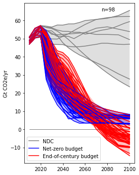
Panel a - GHG emissions developments in stringent mitigation scenarios
GHG emissions in NDC scenarios (grey) compared to stringent mitigation scenarios that reach peak temperatures below 2°C with limited overshoot (net-zero budget scenarios, blue) and mitigation scenarios with the same long-term carbon budget with temperature overshoot (end-of-century budget scenarios, red).
[9]:
fig, ax = plt.subplots(figsize=(4, 5))

ref_df = df.filter(
    variable='Emissions|Kyoto Gases',
    budget_type='reference', scenario_family='INDCi'
)
ref_df.plot(ax=ax, color='category', fill_between=True)

npi_df = df.filter(
    scenario_family='NPi',
    category_peak=['1.5C (with low overshoot)', '2C'],
    variable='Emissions|Kyoto Gases'
)
npi_df.plot(ax=ax, color='budget_type', fill_between=True)

plt.hlines(y=0, xmin=2010, xmax=2100, color="black", linewidths=0.5)

pyam.plotting.set_panel_label(f"n={len(ref_df.index) + len(npi_df.index)}", ax=ax, x=0.7, y=0.95)
ax.set_title(None)
ax.set_xlabel(None)
ax.legend([mpl.lines.Line2D([0, 1], [0, 1], color=c) for c in ['grey', 'blue', 'red']],
          ['NDC', 'Net-zero budget', 'End-of-century budget'], loc=3)

plt.tight_layout()
fig.savefig(output_folder / f"fig1a_ghg.{output_format}", **plot_args)
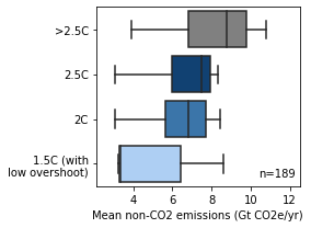
Panel b - Residual non-CO2 emissions
Residual non-CO2 emissions after the point of reaching net-zero CO2 emissions for specified temperature stabilization levels. The box shows the quartiles of the dataset while the whiskers extend to show the rest of the distribution.
[10]:
df_nonco2 = (
    df
    .filter(budget_type="reference", keep=False)
    .filter(scenario_family="NPi")
    .subtract("Emissions|Kyoto Gases", "Emissions|CO2", "Emissions|Non-CO2", ignore_units="Gt CO2e/yr")
)
[11]:
def get_from_meta_column(df, x, col):
    val = df.meta.loc[x.name[0:2], col]
    return val if val < np.inf else max(x.index)
[12]:
df_nonco2.set_meta(
    df_nonco2.timeseries().apply(
        lambda x: pyam.fill_series(x, get_from_meta_column(df, x, "netzero|CO2")),
        raw=False, axis=1),
    "non-CO2 in year of CO2 net-zero"
)
[13]:
def get_average(x, y):
    # downselect to years after netzero `y`
    _x = x[[i > y for i in x.index]]
    # concatenate value in year of netyero `y` with series after `y`, and compute average
    return pd.concat([pd.Series(pyam.fill_series(x, y), index=[y]), _x]).mean()
[14]:
df_nonco2.set_meta(
    df_nonco2.timeseries().apply(
        lambda x: get_average(x, get_from_meta_column(df, x, "netzero|CO2")),
        raw=False, axis=1),
    "average non-CO2 after year of CO2 net-zero"
)
[15]:
fig, ax = plt.subplots(figsize=(4, 3))

df_nonco2.plot.box(
    ax=ax,
    x="average non-CO2 after year of CO2 net-zero",
    y="category",
    order=[">2.5C", "2.5C", "2C", "1.5C (with low overshoot)"],
    palette=rc["color"]["category"],
    legend=False,
)

ax.set_title(None)
ax.set_xlabel("Mean non-CO2 emissions (Gt CO2e/yr)")
ax.set_xlim(2.1, 12.5)
ax.set_ylabel(None)
ax.set_yticklabels([">2.5C", "2.5C", "2C", "1.5C (with\nlow overshoot)"])
pyam.plotting.set_panel_label(f"n={len(df_nonco2.index)}", ax=ax, x=0.8, y=0.05)

plt.tight_layout()
fig.savefig(output_folder / f"fig1b_non_co2.{output_format}", **plot_args)
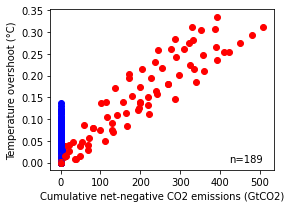
Panel c - Cumulative net-negative CO2 emissions
Relationship between cumulative net-negative CO2 emissions (NNCE) and resulting temperature drawdown after peak temperature (that is, overshoot); net-zero scenarios (red) and end-of-century scenarios (blue).
[16]:
df_co2 = df.filter(variable="Emissions|CO2")
Derive net-negative CO2 emissions and set as quantitative meta indicator
[17]:
co2_netneg = df_co2.timeseries().applymap(lambda x: - min(x, 0))

nn_label = "Cumulative net-negative CO2 emissions (GtCO2)"
df_co2.set_meta(
    meta=co2_netneg.apply(pyam.cumulative, axis=1, first_year=2020, last_year=2100),
    name=nn_label
)
Remove all scenarios that do not report GHG explicitly for comparibility to panel b
[18]:
df_ghg_nonref = df_ghg.filter(budget_type='reference', keep=False)

df_co2.set_meta(meta=True, name="has_ghg", index=df_ghg_nonref.index)
df_co2.filter(has_ghg=True, inplace=True)
Plot the data!
[19]:
overshoot_label = 'Temperature overshoot (°C)'
df_co2.meta[overshoot_label] = df_co2.meta['median warming peak-and-decline']

_df_co2 = df_co2.filter().filter(scenario_family="NPi")

fig, ax = plt.subplots(figsize=(4, 3))
_df_co2.plot.scatter(ax=ax, x=nn_label, y=overshoot_label, color='budget_type', legend=False)

ax.set_title(None)
pyam.plotting.set_panel_label(f"n={len(_df_co2.index)}", ax=ax, x=0.8, y=0.05)

plt.tight_layout()
fig.savefig(output_folder / f'fig1c_overshoot_netnegative_co2.{output_format}', **plot_args)
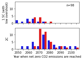
Panel d - Relationship between the budget and time of net-zero
Timing of when net-zero CO2 emissions are reached. Net-zero budget scenarios consistent with 1.5 °C (low overshoot) and 2 °C respectively (blue bars) are compared to scenarios with the same end-of-century carbon budget with net-negative emissions (red bars). The height of the bars indicates the number of scenarios that reach net zero at the specific year.
[20]:
netzero_bins = list(range(2050, 2101, 5)) + [">2100"]

def assign_nz_bin(x):
    for b in netzero_bins:
        try:
            if x < b:
                return b
        # this approach works as long as only the last item is a string
        except TypeError:
            return b
[21]:
cats_2c = ["1.5C (with low overshoot)", "2C"]
[22]:
x = df.filter(category_peak=cats_2c, scenario_family="NPi").meta
[23]:
x["netzero"] = x["netzero|CO2"].apply(assign_nz_bin)
The pyam package does not support histogram-type plots, so panel d is implemented directly in seaborn.
[24]:
fig, ax = plt.subplots(2, 1, figsize=(4, 3), sharex=True, sharey=True)

for i, label in enumerate(cats_2c):
    _x = x[x["category_peak"] == label]
    sns.countplot(
        ax=ax[i],
        data=_x,
        x="netzero",
        hue="budget_type",
        order=netzero_bins,
        palette=dict(peak_budget="blue", full_century_budget="red"),
    )
    ax[i].set_xlabel(None)

    ax[i].set_xticklabels([2050, "", 2060, "", 2070, "", 2080, "", 2090, "", 2100, ""])
    ax[i].set_ylabel(label)
    ax[i].get_legend().remove()

pyam.plotting.set_panel_label(f"n={len(x['netzero'])}", ax=ax[0], x=0.8, y=0.8)

ax[0].set_ylabel("1.5C (with\nlow overshoot)")
ax[1].set_xlabel("Year when net zero CO2 emissions are reached")

plt.tight_layout()
fig.savefig(output_folder / f"fig1d_netzero_year_hist_by_category.{output_format}", **plot_args)
[ ]: